
How to built modals in Svelte?
A modal is a web page element displayed in front of the current page. Once it shows, it disables all the other components of the webpage. The user must engage with the modal to return to the parent screen.
A modal window is effective to grab the user's attention. The modal component provides a basis for creating dialogs, popovers, lightboxes.
In this article, we learn how to build modals in Svelte. To proceed further we need to install svelte-modals
npm install svelte-modalsIn this article, I presume you are already familiar with the Svelte and know how to create the project from scratch. If you are new here, please visit here.
For styling, we'll use tailwindcss. Please include the following CDN in the index.html under the public folder.
<!DOCTYPE html>
<html lang="en">
<head>
	<meta charset='utf-8'>
	<meta name='viewport' content='width=device-width,initial-scale=1'>

	<title>Svelte app</title>

	<link rel='icon' type='image/png' href='/favicon.png'>
	<link rel='stylesheet' href='/global.css'>
	<link rel='stylesheet' href='/build/bundle.css'>

	<script defer src='/build/bundle.js'></script>
    <!-- Tailwind Added Here -->
	<script src="https://cdn.tailwindcss.com"></script>
</head>

<body>
</body>
</html>
Create a new Svelte file ModalComponent.svelte and add the following code:
<script>
    import {closeModal} from 'svelte-modals'

    export let isOpen

    export let title
    export let message

    let okButton = 'px-6 py-2.5 bg-red-600 text-white font-medium text-xs leading-tight uppercase rounded shadow-md\n' +
        ' hover:bg-red-700 hover:shadow-lg focus:bg-red-700 focus:shadow-lg focus:outline-none focus:ring-0\n' +
        ' active:bg-red-800 active:shadow-lg transition duration-150 ease-in-out';

</script>

{#if isOpen}

    <div class="modal items-center justify-center fade fixed top-0 left-0 hidden w-full h-full outline-none overflow-x-hidden overflow-y-auto"
          tabindex="-1" aria-hidden="true">
        <div class="modal-dialog flex relative w-auto pointer-events-none">
            <div
                    class="modal-content border-none shadow-lg relative flex flex-col w-full pointer-events-auto bg-white bg-clip-padding rounded-md outline-none text-current">
                <div
                        class="modal-header flex flex-shrink-0 items-center justify-between p-4 border-b border-gray-200 rounded-t-md">
                    <h5 class="text-xl font-medium leading-normal text-gray-800">{title}</h5>
                    <button type="button"
                            class="btn-close box-content w-4 h-4 p-1 text-black border-none rounded-none opacity-50 focus:shadow-none focus:outline-none focus:opacity-100 hover:text-black hover:opacity-75 hover:no-underline"
                            data-bs-dismiss="modal" aria-label="Close"></button>
                </div>
                <div class="modal-body relative p-4">
                    {message}
                </div>
                <div class="modal-footer flex flex-shrink-0 flex-wrap items-center justify-end p-4 border-t border-gray-200 rounded-b-md">
                    <button type="button" class="{okButton}" on:click={closeModal} data-bs-dismiss="modal">Ok</button>
                </div>
            </div>
        </div>
    </div>
{/if}


<style>
    .modal {
        display: flex;
    }

</style>
The modal styling is inspired from tailwind component.
In the import {closeModal} from 'svelte-modals' is to close the Modal. And title and message variables are used for the Titles and Body of the modals respectively.
Now we need to include this in our App.svelte.
<script>
import { Modals, closeModal } from 'svelte-modals'
import { openModal } from 'svelte-modals'
import ModalComponent from "./ModalComponent.svelte";
function handleClick() {
openModal(ModalComponent, { title: "Title of the Modal", message: "This is an alert using Svelte-Modal" })
}
</script>
<Modals>
<div slot="svelte-modal" on:click={closeModal}></div>
</Modals>
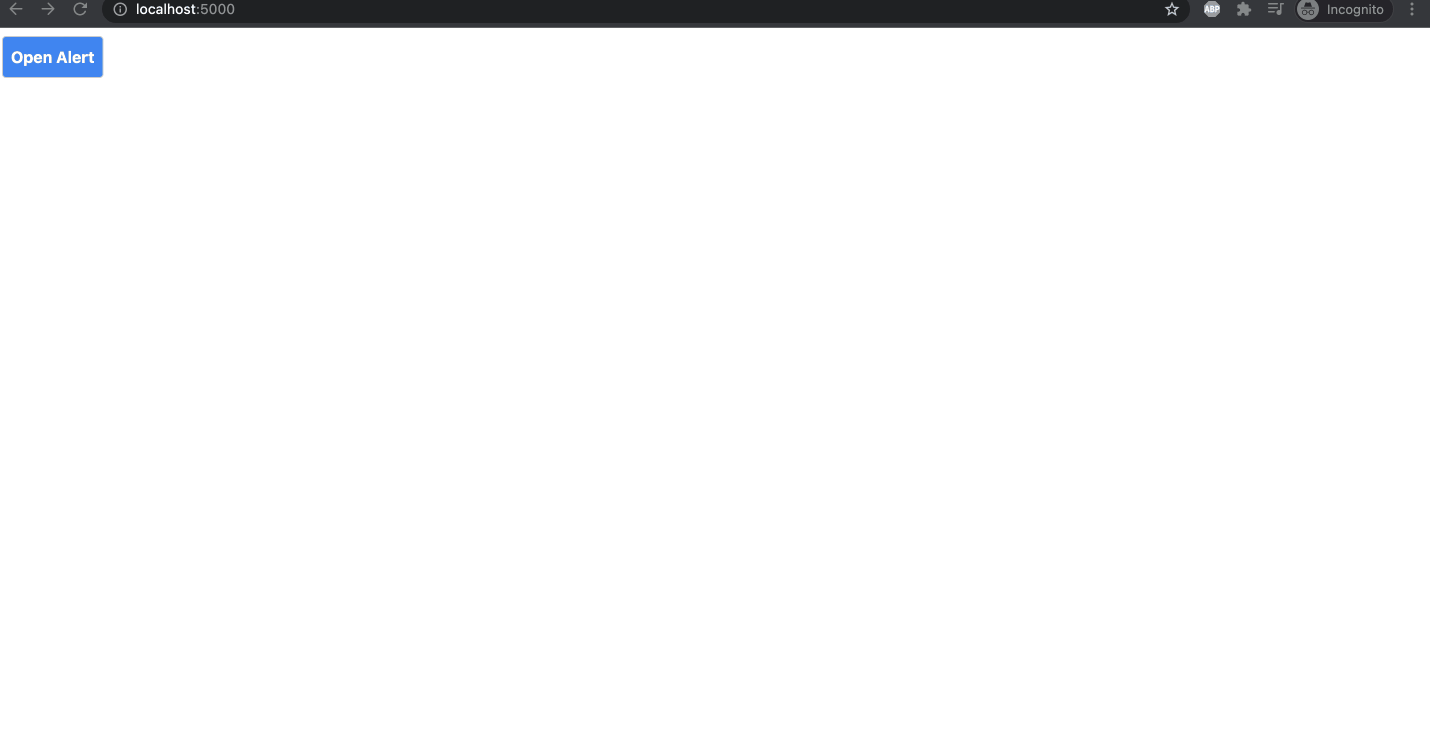
<button class="rounded bg-blue-500 py-2 px-2 text-white font-bold" on:click={handleClick}>
Open Alert
</button>
We imported Modals and the ModalComponent in the App.svelte. Thats all, what we need to do. It will look like the below gif.
See you in the next article.
AK Newsletter
Join the newsletter to receive the latest updates in your inbox.

